The SwiftUI TabView allows you to create a tabbed view and is a great container for several of your main views. Each tab displays another main view, allowing your user to quickly switch between the most important sections of your app.
Developers often use a SwiftUI Tab view as the app’s core container. It is one of the first views an end user sees, and tab views are frequently used to switch between core sections. Apple also uses this common navigation pattern, like in the official iOS App Store application.

Creating a basic SwiftUI TabView
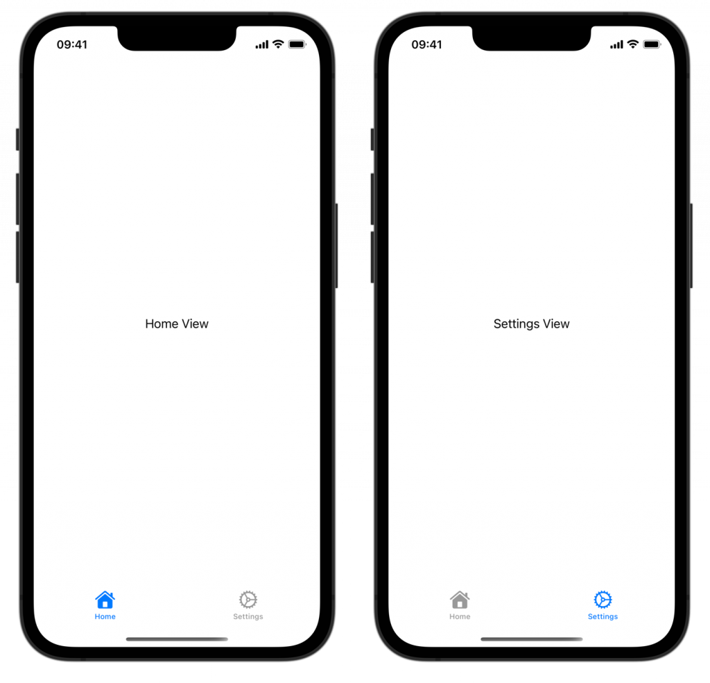
Let’s start with a simple example of a SwiftUI TabView with two tabs. Each tab shows a different SwiftUI view:
struct ContentView: View {
    var body: some View {
        TabView {
            Tab("Home", systemImage: "house") {
                HomeView()
            }
            Tab("Settings", systemImage: "gear") {
                SettingsView()
            }
        }
    }
}
In this example, the TabView holds two tabs: “Home” and “Settings”. Each tab item takes a title and a system image that references an SF Symbol (learn more about SF Symbols here). SwiftUI takes care of the navigation and visual styling for you.
Showing badges on a tab view
You can show a badge on a tab item to indicate to a user that a tab view contains important information. For example, you could show an exclamation mark if something is wrong or a count to represent the number of unread messages:
struct ContentView: View {
    var body: some View {
        TabView {
            Tab("Home", systemImage: "house") {
                HomeView()
            }
            Tab("Messages", systemImage: "message") {
                MessagesView()
            }
                // You can use integers:
                .badge(2)
            Tab("Settings", systemImage: "gear") {
                SettingsView()
            }
                // Or you can use a `String`:
                .badge("!")
        }
    }
}
This results in the following tabbed view in SwiftUI:
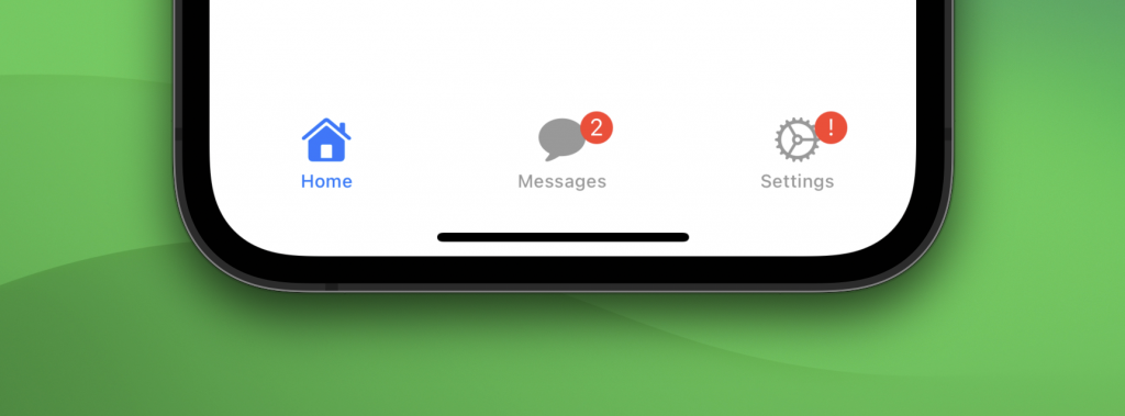
As you can see, you can both use integers and strings as a value for a badge.
Programmatically selecting a tab view in SwiftUI
It’s common to programmatically switch between SwiftUI tabbed views, which can be achieved by using the value parameter in combination with a selection state:
struct ContentView: View {

    @State private var selection: Int = 0

    var body: some View {
        TabView(selection: $selection) {
            Tab("Home", systemImage: "house", value: 0) {
                Button("Go to settings") {
                    // Change the selection on button tap to match the value of Settings:
                    selection = 1
                }
            }
            Tab("Settings", systemImage: "gear", value: 1) {
                SettingsView()
            }
        }
    }
}
In this example, we’ve added a new state property selection, and used it in the SwiftUI TabView initializer. We assigned a value to each tab and used it accordingly when the user tapped the button.
You can change the default value of selection to change the default selected tab, if you will.
Allowing users to change the order of tab views
When you’re using the sidebarAdaptable style, you can allow your users to drag tabs from the sidebar to the tab bar, hide tabs, and rearrange tabs within the sidebar. This option can be convenient if your app has many important pages and a user preference could apply.
In the following example, we allow users to modify the messages and settings page. In this case, the user can’t adjust the home page which makes it always appear as the first item of the SwiftUI TabView:
struct CustomizationTabView: View {

    @AppStorage("tab-view-customization")
    private var customization: TabViewCustomization

    var body: some View {
        TabView {
            Tab("Home", systemImage: "house") {
               HomeView()
            }

            Tab("Messages", systemImage: "message") {
                MessagesView()
            }
                .customizationID("com.swiftlee.tab.messages")
            Tab("Settings", systemImage: "gear") {
                SettingsView()
            }
                .customizationID("com.swiftlee.tab.settings")
        }
        .tabViewStyle(.sidebarAdaptable)
        .tabViewCustomization($customization)
    }
}
There are a few important things to point out:
- Each tab that you want to allow to be modified needs to have a
customizationIDmodifier set - The tab view style needs to be set to
sidebarAdaptable - A new AppStorage-backed
TabViewCustomizationproperty needs to be configured via thetabViewCustomizationmodifier
Once applied, you can customize the tab items accordingly:
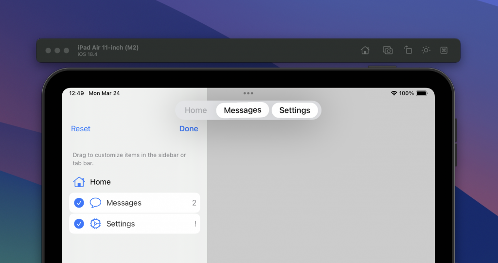
As you can see, only the messages and settings tab have become modifiable.
Using tab sections
When you’re using the earlier mentioned sidebarAdaptable tab view style, you can also make use of tab sections inside a SwiftUI TabView.
Imagine having another page that contains archived messages. We could now combine this new page with the existing messages page inside a new tab section:
struct SectionsTabView: View {
var body: some View {
TabView {
Tab("Home", systemImage: "house") {
HomeView()
}
TabSection("Messages Related") {
Tab("Messages", systemImage: "message") {
MessagesView()
}
Tab("Archive", systemImage: "archivebox") {
MessagesArchiveView()
}
}
Tab("Settings", systemImage: "gear") {
SettingsView()
}
}
.tabViewStyle(.sidebarAdaptable)
}
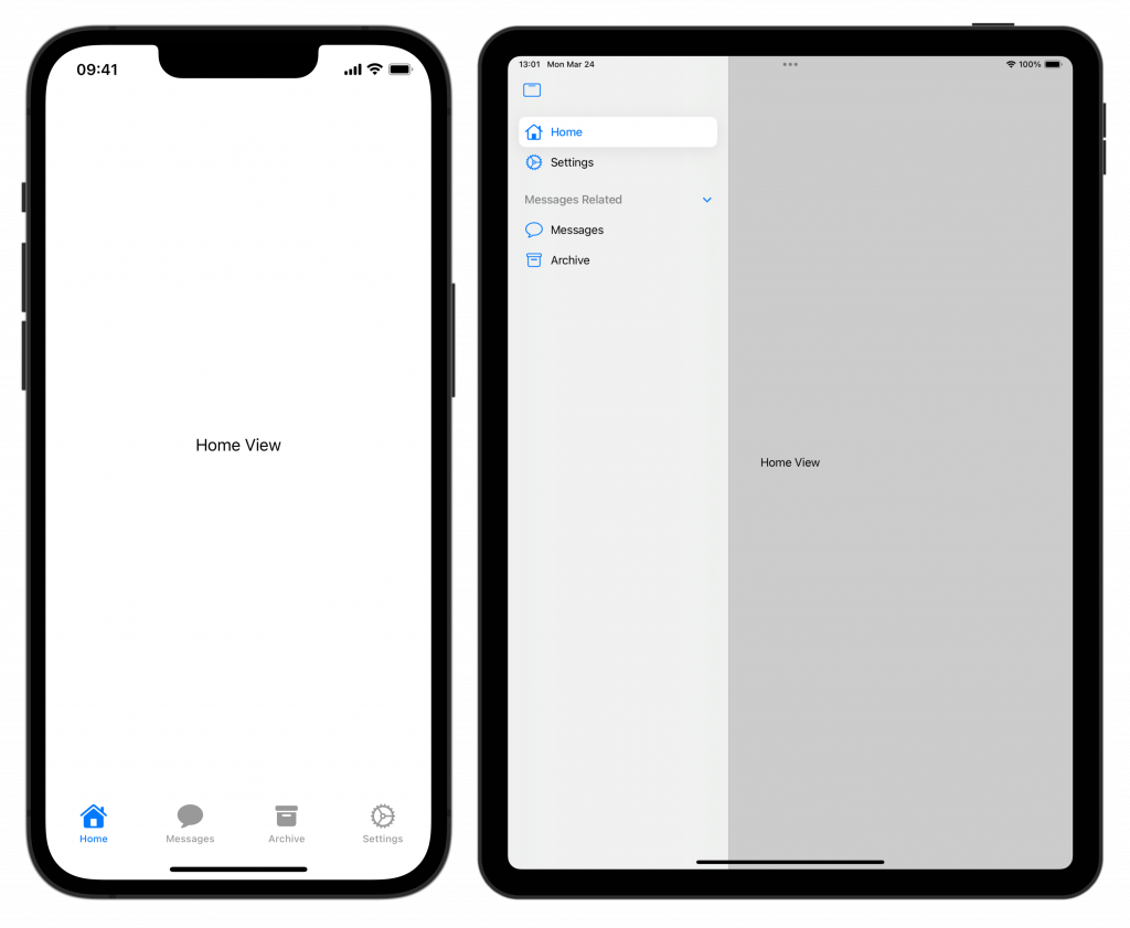
}The Messages Related tab section will show up in the sidebar on iPad, while both tabs will show as normal tabs on an iPhone:
You can customize sections further by adding section actions or by hiding it for tab bars specifically:
TabSection("Messages Related") {
    Tab("Messages", systemImage: "message") {
        MessagesView()
    }
    Tab("Archive", systemImage: "archivebox") {
        MessagesArchiveView()
    }
}.defaultVisibility(.hidden, for: .tabBar)
    .sectionActions {
        Button("Write new message") {
            // ...
        }
    }
Note that this will only hide the section items inside the tab bar on an iPad while the items remain visible on an iPhone. In this example, the section actions can be a great way to offer quick access to the message composer.
Conclusion
A SwiftUI Tab View is easy to set up for basic use cases and can be modified further when working with sidebars on iPadOS. You can use badges to indicate prominent information directly from within a tab item.
If you’re interested in learning more about other SwiftUI elements, I recommend the following articles:
- SwiftUI Alert Guide + Code Examples
- SwiftUI Grid, LazyVGrid, LazyHGrid Explained with Code Examples
- Picker in SwiftUI explained with code examples
- SwiftUI Lists: Present rows of data explained with code examples
- SwiftUI Button: Custom Styles, Variants, and Best Practices
If you want to improve your SwiftUI knowledge, even more, check out the SwiftUI category page. Feel free to contact me or tweet me on Twitter if you have any additional tips or feedback.
Thanks!