You can present a SwiftUI Alert using dedicated view modifiers that make it straightforward to present native alerts. It works a bit differently compared to their UIKit variant, but you’ll get used to them quickly.
In this article, we’re going to dive into the SwiftUI Alert functions and I’ll demonstrate a convenient way of presenting errors inside an alert—a common use case.

How to present a SwiftUI Alert
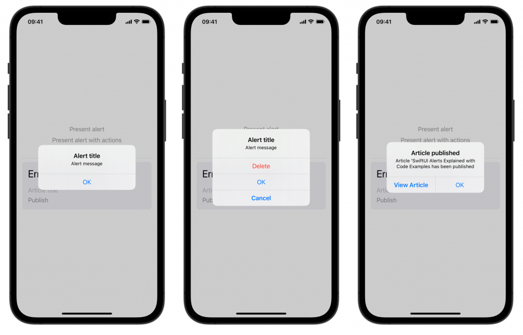
SwiftUI offers several view modifiers for presenting alerts. They all require a isPresented binding that manages the visibility state. A simple example with a title and message could look as follows:
struct SimpleAlertExampleView: View {
    @State private var isPresented: Bool = false

    var body: some View {
        Button("Present alert") {
            isPresented = true
        }.alert("Alert title", isPresented: $isPresented, actions: {
            // Leave empty to use the default "OK" action.
        }, message: {
            Text("Alert message")
        })
    }
}
You can further enhance this with custom actions:
Button("Present alert with actions") {
    isPresented = true
}.alert("Alert title", isPresented: $isPresented, actions: {

    /// A destructive button that appears in red.
    Button(role: .destructive) {
        // Perform the deletion
    } label: {
        Text("Delete")
    }

    /// A cancellation button that appears with bold text.
    Button("Cancel", role: .cancel) {
        // Perform cancellation
    }

    /// A general button.
    Button("OK") {
        // Dismiss without action
    }
}, message: {
    Text("Alert message")
})
Note that there will always be a cancellation button if you’re using a destructive button inside your actions. This is to ensure users have a way to cancel and exit.
Populating SwiftUI Alert data using an input object
You can further enhance your alerts by passing in a specific object. For example, it could be that you want to use a published article in an alert:
struct Article {
    let title: String
    let url: URL
}

struct ObjectInputAlertExampleView: View {
    @State private var isPublished: Bool = false
    let article: Article

    @Environment(\.openURL) private var openURL

    var body: some View {
        Button("Publish Article") {

            /// Perform publishing logic...

            isPublished = true
        }.alert("Article published", isPresented: $isPublished, presenting: article, actions: { article in

            /// Add a button that opens the article URL.
            Button("View Article") {
                openURL(article.url)
            }
            /// Make it the default action on the alert
            .keyboardShortcut(.defaultAction)

            /// Add a generic OK button.
            Button("OK") { }
        }, message: { article in
            Text("Article '\(article.title) has been published")
        })
    }
}
As you can see, we can make use of the input article inside the alert closures to populate the data. We use it to customize the description and to open the article URL with a custom action.
We’ve also use the defaultAction inside the keyboardShortcut modifier to make viewing our published article the default action to perform. This will also make the button appear with a heavier font weight.
All alerts together look as follows:
Error Alert presenting in SwiftUI
Presenting error alerts in apps is essential to communicate failures to your end-users. The happy flow of apps is often implemented well, but the unhappy flow is equally important. Managing all kinds of error alerts can be frustrating if you have to present them all individually.
While building my apps, I’m constantly seeking generic solutions to continue using for future projects. Bundling all those extensions makes it easier for my future self to develop apps and become more productive. One of the solutions I’ve written makes it easy to present an alert whenever you catch a localized error.
What is a localized error?
Before diving into presenting alerts, it’s good to know how a localized error differs from a standard error. A localized error provides localized messages describing the error and why it occurred. We can use this extra context to present an alert with an understandable explanation for our users.
If you want to learn more about error handling in Swift, I recommend reading Try Catch Throw: Error Handling in Swift with Code Examples.
Creating a generic error alert method
The ideal solution is to make it effortless to present any alert based on a thrown error. The method determines whether we can show the error in an alert, so I only have to care about setting up a binding between my view and the potential errors.
In this example, I’m using an ArticleView that allows us to publish an article. Publishing can result in an error, which we want to present in an alert accordingly.
struct ArticleView: View {

    @StateObject var viewModel = ArticleViewModel()

    var body: some View {
        VStack {
            TextField(text: $viewModel.title, prompt: Text("Article title")) {
                Text("Title")
            }
            Button {
                viewModel.publish()
            } label: {
                Text("Publish")
            }
        }.errorAlert(error: $viewModel.error)
    }
}
A new errorAlert(error: Error?) view modifier is introduced, taking an optional error binding argument. Our view model defines the error binding that looks as follows:
final class ArticleViewModel: ObservableObject {
enum Error: LocalizedError {
case titleEmpty
var errorDescription: String? {
switch self {
case .titleEmpty:
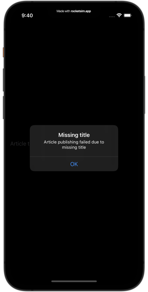
return "Missing title"
}
}
var recoverySuggestion: String? {
switch self {
case .titleEmpty:
return "Article publishing failed due to missing title"
}
}
}
@Published var title: String = ""
@Published var error: Swift.Error?
func publish() {
error = Error.titleEmpty
}
}For this example, I’m always throwing an error when publishing. In this case, we update the error binding with an Error.titleEmpty. The error conforms to the localized error protocol and provides a description and a recovery suggestion. We can now use this metadata to create a generic view extension for presenting a SwiftUI alert.
extension View {
    func errorAlert(error: Binding<Error?>, buttonTitle: String = "OK") -> some View {
        let localizedAlertError = LocalizedAlertError(error: error.wrappedValue)
        return alert(isPresented: .constant(localizedAlertError != nil), error: localizedAlertError) { _ in
            Button(buttonTitle) {
                error.wrappedValue = nil
            }
        } message: { error in
            Text(error.recoverySuggestion ?? "")
        }
    }
}
The extension method takes a binding to an optional error as an argument. We can use this binding to read out the error and set it back to nil so our alert will be dismissed.
We’re using the default alert modifier that requires us to pass a generic LocalizedError. We have to pass our error argument into a custom LocalizedAlertError struct to prevent the following error:
Protocol ‘LocalizedError’ as a type cannot conform to the protocol itself
This structure works as a facade and looks as follows:
struct LocalizedAlertError: LocalizedError {
    let underlyingError: LocalizedError
    var errorDescription: String? {
        underlyingError.errorDescription
    }
    var recoverySuggestion: String? {
        underlyingError.recoverySuggestion
    }

    init?(error: Error?) {
        guard let localizedError = error as? LocalizedError else { return nil }
        underlyingError = localizedError
    }
}
We can return nil by using an optional initializer, allowing us not to present an alert if the thrown error isn’t localized. The binding constant takes the result as input to determine whether the alert should be presented or not:
.constant(localizedAlertError != nil)Altogether, this implementation allows us to show an error-based alert as follows:
struct ArticleView: View {

    @StateObject var viewModel = ArticleViewModel()

    var body: some View {
        VStack {
            TextField(text: $viewModel.title, prompt: Text("Article title")) {
                Text("Title")
            }
            Button {
                viewModel.publish()
            } label: {
                Text("Publish")
            }
        }.errorAlert(error: $viewModel.error)
    }
}
Resulting in an alert representing any localized errors:
You can change this code to only accept a LocalizedError, but it would make it less flexible to work with generic types. For example, we can now use Swift.Error, which basically means our code accepts any error as input.
Conclusion
Using the available view modifiers, we can present a SwiftUI alert in several ways. We can customize actions, titles, and messages. It can also be convenient to pass in a specific object to populate data dynamically.
Presenting errors to our end-users is essential to provide feedback in unhappy flows. By creating a generic solution, we allow ourselves to simplify this kind of implementation. The LocalizedError protocol allows presenting an alert for errors that come out of 3rd party frameworks that aren’t in our control.
If you’re interested in learning more about other SwiftUI elements, I recommend the following articles:
- SwiftUI Grid, LazyVGrid, LazyHGrid Explained with Code Examples
- SwiftUI TabView: Explained with Code Examples
- Picker in SwiftUI explained with code examples
- SwiftUI Lists: Present rows of data explained with code examples
- SwiftUI Button: Custom Styles, Variants, and Best Practices
If you want to improve your SwiftUI knowledge, even more, check out the SwiftUI category page. Feel free to contact me