SwiftUI Grid, LazyVGrid, and LazyHGrid are UI elements that allow you to place views in a structured grid. You can control the horizontal and vertical spacing, columns, and rows. You typically use the lazy variants for performance improvements since they load items lazily when they need to enter the screen after scrolling. A SwiftUI Gridview is a great element for designs that require a two-dimensional layout.
While the three views have similarities, they also differ in usage in some parts. Let’s dive into each, starting with the non-lazy one: the Grid view.

Creating a Grid view in SwiftUI
Starting with iOS 16, SwiftUI introduces a native Grid container, making it easier to build grid-based layouts. Unlike traditional stacks, a Grid view allows for precise row and column alignment, letting you create spreadsheet-like or dashboard layouts.
Here’s an example of a SwiftUI Grid view:
Grid(horizontalSpacing: 30, verticalSpacing: 30) {
    GridRow {
        Text("(0, 0)")
        Text("(1, 0)")
        Text("(2, 0)")
    }

    GridRow {
        Text("(0, 1)")
        Text("(1, 1)")
        Text("(2, 1)")
    }

    GridRow {
        Text("(0, 2)")
        Text("(1, 2)")
        Text("(2, 2)")
    }
}
As you can see, we’ve statically defined the contents of the SwiftUI gridview. We’ve also configured horizontal and vertical spacing inside the initializer. A similar output could be generated using two ForEach statements:
Grid(horizontalSpacing: 30, verticalSpacing: 30) {
    ForEach(0..<3) { row in
        GridRow {
            ForEach(0..<3) { column in
                Text("(\(column), \(row))")
            }
        }
    }
}
The first ForEach defines the number of rows (vertically), while the second defines the number of columns (horizontally). The output looks as follows:
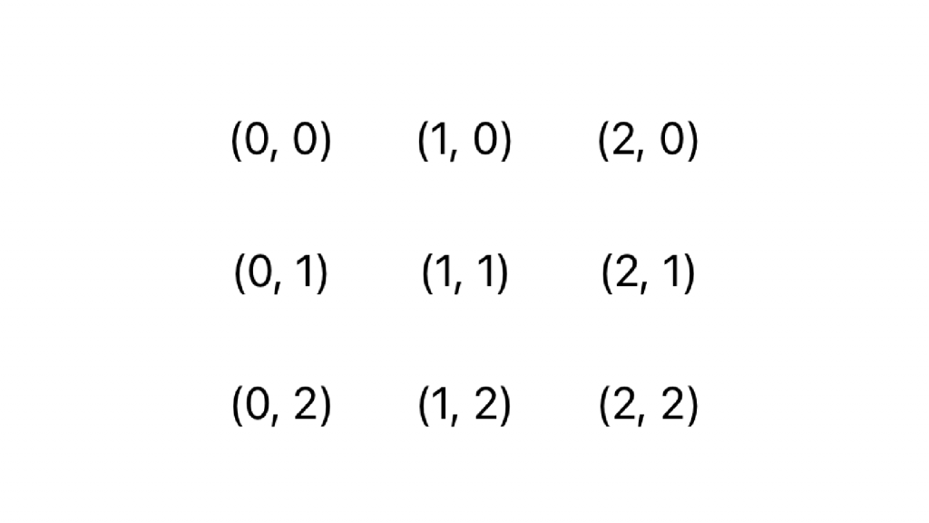
We’ve created a 3×3 grid layout. Each GridRow groups the views horizontally, and the Grid stacks them vertically. SwiftUI automatically aligns columns based on the structure of the rows.
Spanning items over multiple Grid Columns
In some cases, you want to span an item over multiple columns. This is especially useful when you’re creating footers or headers for your grid. You can do this using the .gridCellColumns(_:) modifier:
Grid(horizontalSpacing: 30, verticalSpacing: 30) {
    ForEach(0..<3) { row in
        GridRow {
            ForEach(0..<3) { column in
                Text("(\(column), \(row))")
            }
        }
    }
    GridRow {
        Text("Full Width, for example for footers!")
            .gridCellColumns(3)
    }
}
The difference becomes clear when showing the same Grid view with and without the grid cell columns modifier:
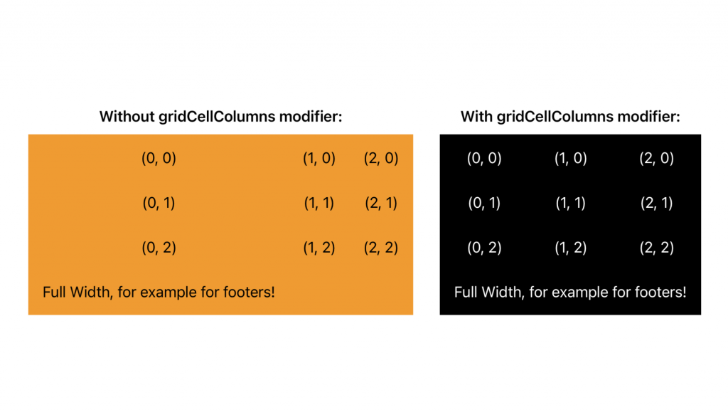
As you can see, the second example remains as wide as the version we’ve had before without the footer.
Using views directly inside grids
The above example could have been simplified by using a text view directly inside the SwiftUI gridview:
Grid(horizontalSpacing: 30, verticalSpacing: 30) {
    ForEach(0..<3) { row in
        GridRow {
            ForEach(0..<3) { column in
                Text("(\(column), \(row))")
            }
        }
    }
    Text("Full Width, for example for footers!")
}
This is because SwiftUI grids accept regular views as full-width child components. In the above example, you’ll get the same result as using the gridCellColumns(_:) modifier.
There are cases where this behavior results in an unexpected output. For example, you might want to use a divider in between your rows:
Grid(horizontalSpacing: 30, verticalSpacing: 30) {
GridRow {
Text("(0, 0)")
Text("(1, 0)")
Text("(2, 0)")
}
Divider()
GridRow {
Text("(0, 1)")
Text("(1, 1)")
Text("(2, 1)")
}
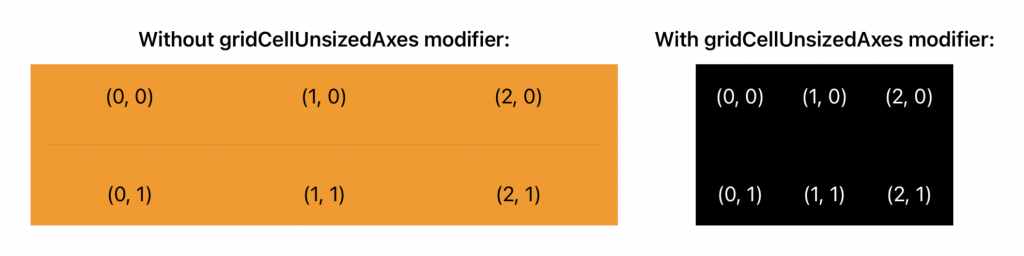
}The divider fits well but will take up all the available horizontal width. This could suddenly make your grid much wider than it needs based on the row’s contents. In these cases, you can make use of the gridCellUnsizedAxes(_:) modifier:
Grid(horizontalSpacing: 30, verticalSpacing: 30) {
    GridRow {
        Text("(0, 0)")
        Text("(1, 0)")
        Text("(2, 0)")
    }
    Divider()
        .gridCellUnsizedAxes(.horizontal)
    GridRow {
        Text("(0, 1)")
        Text("(1, 1)")
        Text("(2, 1)")
    }
}
You can see the difference in output in the following screenshot:
Cell spacing, alignment, and column count
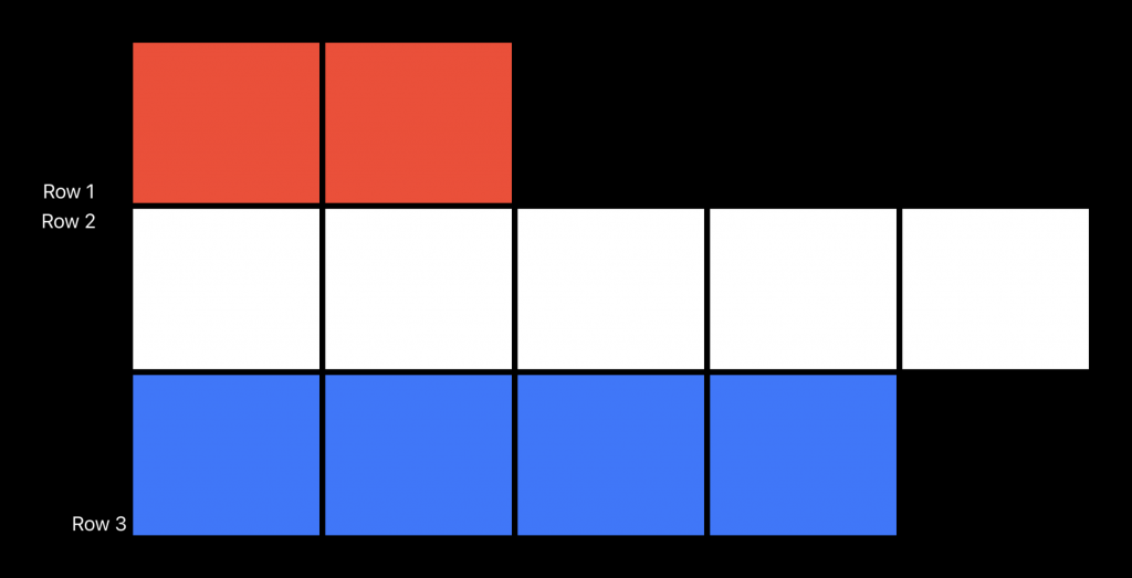
The grid view’s width is based on the row with the largest number of columns. You can define the cell spacing and alignment inside the initializer of the SwiftUI Gridview. For example, you could generate a grid with colored squares:
Using the code below:
Grid(alignment: .bottom, horizontalSpacing: 5, verticalSpacing: 5) {
    GridRow {
        Text("Row 1")
            .frame(width: 100)
        ForEach(0..<2) { _ in Color.red }
    }
    GridRow {
        Text("Row 2")
            .gridCellAnchor(.top)
        ForEach(0..<5) { _ in Color.white }
    }
    GridRow {
        Text("Row 3")
            .gridColumnAlignment(.trailing)
        ForEach(0..<4) { _ in Color.blue }
    }
}
Note that we’ve been using several view modifiers in this example as well:
- We set the width of the whole column to 100 using the first-row column.
- In the second row, we’re applying a custom grid cell anchor.
- Finally, we’re using a custom grid column alignment for the last-row column.
These modifiers give you all the flexibility to move around your grid view content.
Optimizing performance using LazyHGrid and LazyVGrid
A grid view in SwiftUI doesn’t support scrolling and can be wrapped inside a ScrollView if needed. This works fine with a small dataset but can result in performance issues when your dataset grows.
A lazy grid only creates views when they’re about to appear on screen—a standard Grid generates all of its cells immediately. It’s best to stick with Grid unless performance testing shows it struggles due to rendering too many views at once—then switching to a lazy grid might help.
For example, imagine creating a lazy vertical grid using 1000 items:
ScrollView {
    LazyVGrid(
        columns: [
            GridItem(.fixed(100)),
            GridItem(.flexible(minimum: 50, maximum: .infinity)),
            GridItem(.flexible(minimum: 50, maximum: .infinity))
        ],
        alignment: .leading,
        spacing: 10
    ) {
        ForEach(0..<1000, id: \.self) { column in
            Text("\(column)")
                .frame(height: 100)
                .frame(maxWidth: .infinity)
                .background(Color.gray.opacity(0.2))
                .border(Color.gray)
        }
    }.padding()
}
We’ve aligned the grid to the leading edge of the scrollview and configured the first column to be a fixed width of 100. The last two columns can have a flexible width to fill up the space, but should at least be 50 in width. This creates a LazyVGrid with three columns that have a spacing of 10 between them.
You could write the same for a LazyHGrid as follows:
ScrollView(.horizontal) {
    LazyHGrid(rows: [
        GridItem(.fixed(100)),
        GridItem(.flexible(minimum: 50, maximum: .infinity)),
        GridItem(.flexible(minimum: 50, maximum: .infinity))
    ], alignment: .top, spacing: 10) {
        ForEach(0..<1000, id: \.self) { column in
            Text("\(column)")
                .frame(width: 100)
                .frame(maxHeight: .infinity)
                .background(Color.gray.opacity(0.2))
                .border(Color.gray)
        }
    }.padding()
}
Note that we’re now defining each row’s height instead of each column’s width. Therefore, we must also set a width and maximum height for our text element. The way items are laid out is best described by looking at both code examples side by side:
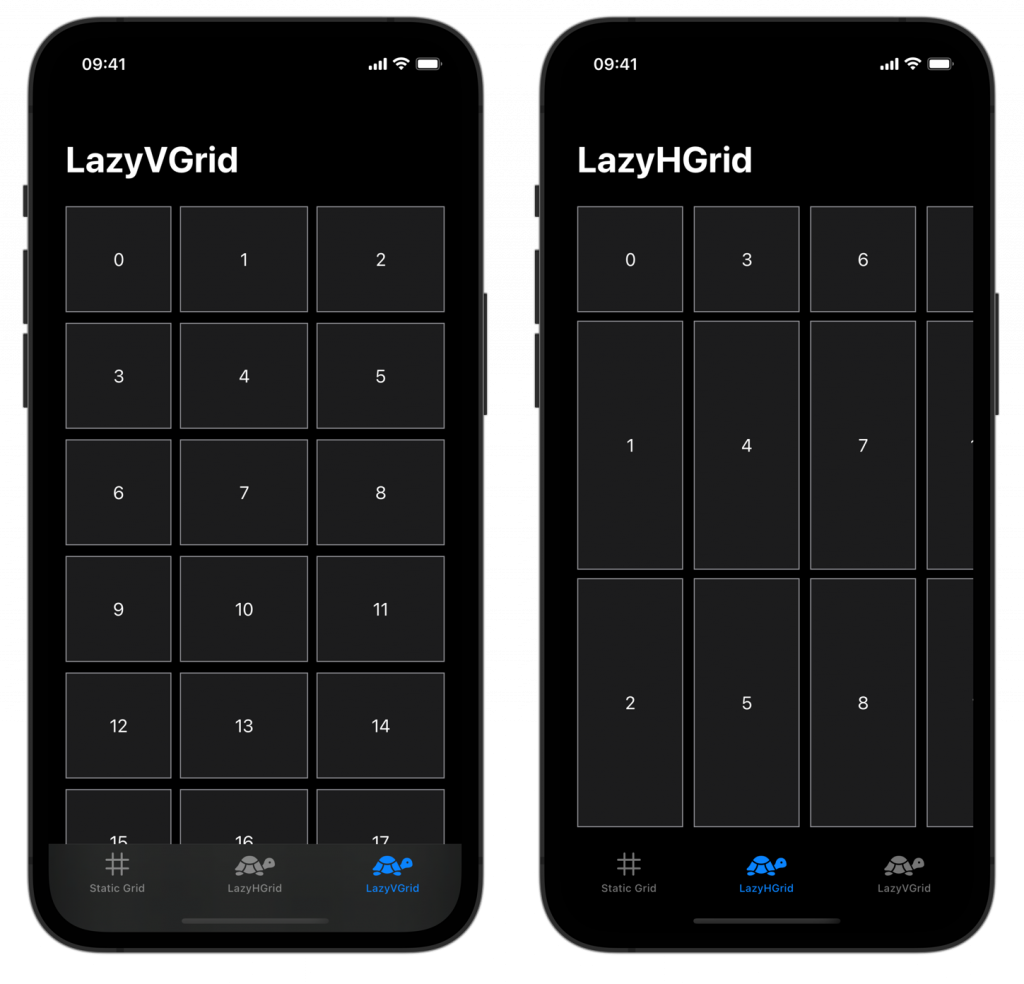
You can see that a LazyVGrid lays out elements from left to right, while the LazyHGrid from top to bottom. You should use the LazyVGrid when scrolling vertically and the LazyHGrid when scrolling horizontally.
Conclusion
A SwiftUI Grid allows you to present a static set of rows and columns when performance is not an issue. You can define the number of columns and rows, spacing, and alignment. If performance becomes an issue, you can upgrade to a LazyVGrid or LazyHGrid.
If you’re interested in learning more about other SwiftUI elements, I recommend the following articles:
- SwiftUI Alert Guide + Code Examples
- SwiftUI TabView: Explained with Code Examples
- Picker in SwiftUI explained with code examples
- SwiftUI Lists: Present rows of data explained with code examples
- SwiftUI Button: Custom Styles, Variants, and Best Practices
If you want to improve your SwiftUI knowledge, even more, check out the SwiftUI category page. Feel free to contact me or tweet me on Twitter if you have any additional tips or feedback.
Thanks!