An app onboarding can be seen as a funnel full of steps toward the key action of your application. A user installs your app, enters an explanatory onboarding, and starts using the app with the knowledge gained. Each step in the funnel is vital for ensuring the user knows how to use the app, but each step is also a potential drop-off moment. Visualizing and optimizing these individual steps is essential to increase in-app conversions.
What many need to remember is that the onboarding funnel starts outside of the app. The first moment a user sees your app is the first step of the funnel, followed by an App Store page and the actual in-app onboarding. Secondly, it’s essential to know your app’s key action that leads to the most user satisfaction or paid conversions. Depending on your funnel optimization goal, this key action will help you track the performance. In this article, I’ll share learnings from the “Marketing and Audience Growth” course module found at going-indie.com.
Defining your app’s key action and result
Your app likely contains many features, some more important than others. When optimizing your app, you will set a conversion goal you want to improve. A typical example is to focus on in-app conversions toward a paid subscription.
Using analytics, you can define which actions lead to an in-app conversion. From those actions, there will likely be one or more that lead to a paid conversion the most. For example, my developer tool RocketSim often leads to a paid conversion when the user inspects network traffic using the Xcode Simulator. In this example, the key action would be inspecting network traffic, and the key result is a conversion to a paid subscription.
The next step is to analyze the funnel toward this key action. If you can lead more users into the network traffic inspection feature, you’re likely also increasing the number of paid conversions. Similarly, if you have a first-launch app onboarding that ends with a paywall, you want to make sure as many users as possible end up at the paywall. The key action is finalizing the onboarding, and the key result is a paid conversion.
Let’s use the last example to dive into analyzing funnels.
Analyzing your in-app onboarding funnel
Once you’ve defined your key action and result, it’s time to analyze the app onboarding funnel. Whether it’s a funnel on an app launch or in the middle of a user journey, you should be able to track the individual steps using your analytics tool. I’m a big fan of both Amplitude and Datadog, but any analytics tool that enables you to visualize funnel steps works. In this article, I’ll show examples of how I track RocketSim’s onboarding funnel using Amplitude.
Each step of the funnel is a potential user drop-off. If the user doesn’t understand or like the funnel step, they might end their journey. This is especially crucial during first-launch app onboarding since your users might still need to learn what they’re missing out on. A user who has already created a habit of using your app will likely push through the end of an in-app funnel.
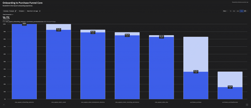
RocketSim’s onboarding funnel contains critical steps like providing Xcode and Developer Directory permissions. The app would not be usable when any of these steps fail. The complete onboarding funnel looks as follows:

The funnel starts with the view-appearing event for the onboarding welcome page and ends with a paid conversion. At each step, you can see the percentage of users that made it through. We can conclude a few things:
- 7.5% of the users drop off at the welcome page. They’ve installed the app but don’t even make it to the second onboarding page. I’ll get back to this one later.
- 83.1% make it through the setup and end up at the paywall screen. For RocketSim, this means they made it into a state where the app becomes usable.
- 16.1% of the users that start the onboarding convert to a (trial) subscription.
You can immediately see how many insights I get from this single funnel. I can focus on each step of the funnel and compare them using experiments, potentially leading to more users converting to the end of my app onboarding.
Performing experiments to optimize individual funnel steps
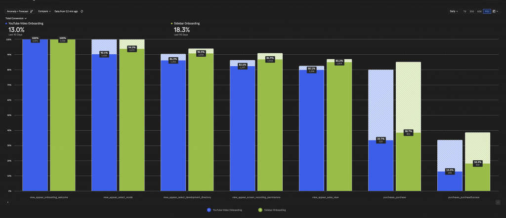
Once you’ve visualized one of your app onboarding funnels, you can dive deeper into individual steps. For example, RocketSim’s onboarding contains a features explanation page. I first used a YouTube video, which quickly became outdated and didn’t look great with an unthemed in-app YouTube player. I decided to optimize this page of the funnel with a native sidebar-detail design and tracked it as an experiment:

Note: The optimized page sits between view_appear_onboarding_welcome and view_appear_select_xcode. I was unable to visualize this individual page since I the two pages use different tracking names.
There are a few insights we can get from both onboarding versions:
- An extra 3.6% of users end up on the Select Xcode page. The YouTube video might have been disappointing or distracting, or the next button needed to be more visible. One thing is clear: the new version leads to more users continuing the onboarding flow.
- We’ve improved the key action of viewing the sales page by 5.1%.
- As taught before, more users performing the key action often leads to more conversions. We’ve increased paid conversions by 5.3%.
In this particular example, we’ve not only optimized an individual step, but we’ve also better explained what the app does and how the user can benefit from it. Likely, RocketSim’s feature page with a YouTube demonstration didn’t convey RocketSim’s actual value. Being able to explain your app’s added value will impact the number of users who decide to go for a paid subscription.
I purposely didn’t share screenshots of my before and after onboarding page since the key of this article is to focus on funnel optimizations, not on how to build better app onboarding designs. Each app’s onboarding is different, and what works for RocketSim might not work for your app. Once again, analyze, optimize, and experiment. To learn more about this, check out my course Module 6: Financial Strategies.
Tracking funnel steps outside of your app
Bringing more users into your app is great, but if your app’s not ready for it, you’re not making the most out of this opportunity. By now, you know how to analyze and optimize individual funnels. Once you think your app is ready to receive more users, you can focus on optimizing funnels outside of your app.
Paid acquisitions are a great example to mention here. You’re paying for advertisements to bring more users in, but without optimizing the user’s first onboarding experience, you’ll likely be paying a lot for nothing. Much better would be to prepare your paid acquisition funnel from start to end before spending more money on ads.
7.5% of the users drop off at the welcome page. They’ve installed the app but don’t even make it to the second onboarding page. I’ll get back to this one later.
There could be several reasons for users dropping off at the first launch of your app. It might be as simple that they weren’t ready to use your app. You should be able to exclude this scenario from your funnel chart. Another reason could be that they expected a different onboarding experience based on their out-of-the-app journey.
I recommend analyzing and optimizing funnels outside of your app to increase your app’s key action. For example:
- Experiment with advertisements. Use different copies or different platforms.
- Use Custom Product Pages, especially now that you can use custom deeplinks.
The latter is new since WWDC 2024 and allows you to open the app with a specific deeplink. In other words, the following journey would be possible:
- A user views an advertisement for inspecting network traffic using RocketSim
- The advertisement links to a custom product page. The first page shows “Inspecting Network Traffic using RocketSim” to make the user feel at home: they recognize this content from the ad.
- Using a custom deeplink, the in-app onboarding of RocketSim focuses on “Inspecting Network Traffic using the Xcode Simulator” to further increase the chances of the user converting.
By optimizing the outside funnels toward the in-app onboarding funnel, we’re improving the number of users that make it to our key action and result. It requires dedication, time, and many experiments, but the reward can be high.
Conclusion
Apps are full of funnels that can be optimized based on a key action and result. Instead of building new features, you can focus on what you already have an optimize based on analytics.
This article only contained a blip of what you can do. If you’re excited to learn more, especially how to apply these techniques on personal side projects, I invite you to follow my course, From Side Project to Going Indie. We’ll cover related topics like:
- The Flywheel Concept: Reinvesting for Growth
- App Monetization Techniques: Strategies to optimize products for income
- Building and Nurturing Your Audience
And much more. I’d be honored to help you grow your side projects and income.
Thanks!