Building custom elements and ignoring the sometimes boring system components during app design can be appealing. However, these boring elements have many benefits you might not be aware of.
If you’ve read many of my technical articles, you might be surprised to hear that I’ve actually done a bachelor’s degree in Communication and Multimedia Design (CMD), also known as Interactive Media, in Amsterdam. I’ve had to teach myself coding on the side, resulting in a great mix of design and coding knowledge. In today’s article, I’ll share a few reasons why system components should not be overlooked.

What are system components?
System components are UI elements that you get for free. For example, you can use a button system component in SwiftUI as follows:
Button("Get Started") {
    goToNextPage()
}.buttonBorderShape(.capsule)
    .buttonStyle(.borderedProminent)
The opposite would be to define a custom UI element for a button using regular views. For example, using a text element combined with a tap gesture:
Text("Get Started")
    .onTapGesture {
        goToNextPage()
    }
While both views result in a clickable element, their outcome performance differs by a lot. Let’s go over all the benefits you get when using a system component.
1. Accessibility for free
SwiftUI excels in accessibility support, particularly with its system components. For instance, a default button in SwiftUI inherently includes the isButton accessibility trait.
When creating custom components, it’s essential to integrate accessibility considerations from the outset. Take a custom button with a tap gesture, for example; you’ll need to manually add the isButton trait to ensure it is accessible. Overall, leveraging system components in SwiftUI provides superior foundational accessibility support, making it a preferable choice for enhancing accessibility in your applications.
2. Users are familiar with system components
When you decide to use system components, you automatically decide to use components that are used in other apps on the system. Your users will feel familiar with your app’s design, likely making it easier for them to navigate through your pages.
3. Speeds up the design process
Building custom components for app design takes more time than using system components. Adding a default SwiftUI toggle, for example, is much faster than manually handling all states.
This benefit especially counts when working on a side project where time is limited. In module 4 of my course, From Side Project to Going Indie, I’ll go deeper into design apps when time is limited and share more of my personal practical tips.
4. App design consistency results in better app performance
When you’re using system components, you’re automatically creating a consistent design. A consistent design goes further and includes consistent spacing, colors, and fonts. Altogether, these choices lead to a consistent user experience in which users better understand your UX, likely leading to better app performance and conversions.
5. Optimized affordance for free
Affordances are features or attributes of an object that indicate how to use it, showing the user that the object is interactive. System components, by default, offer great affordance and are familiar to users. This familiarity helps users understand how to use them, allowing them to stay in their flow.
As an example, take this onboarding page for my Stock Analyzer app:
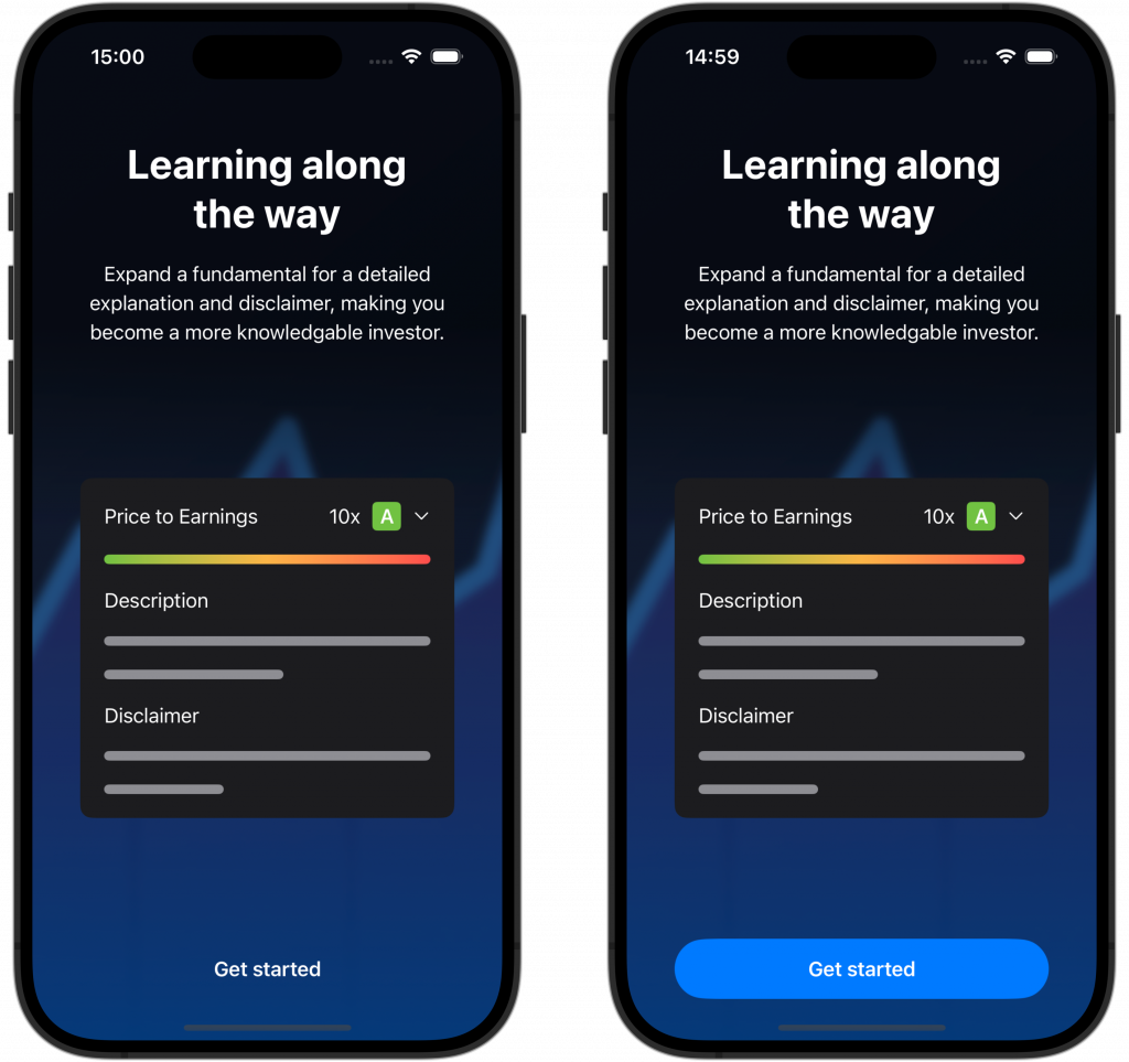
The left version shows a “Get started” at the bottom in plain white text. The right side shows a system capsule button in the app’s primary tint. Which of the two versions is more clearly showing where to go next?
In terms of accessibility, the blue color on a dark blue background isn’t great, so there’s still room for improvement. However, this example does clearly show how using a familiar system component can help you improve affordance and an app’s design.
Conclusion
Using system components speeds up the design process and results in a familiar design for your app’s users. You’ll get better accessibility support for free, and due to better affordance, your app will likely perform better and get higher conversions.
If you like to improve your Swift knowledge even more, check out the Swift category page. Feel free to contact me or tweet me on Twitter if you have any additional tips or feedback.
Thanks!