The picker control in SwiftUI allows you, as a developer, to create a UI element for users to select from a set of values. It comes in different styles, and the segmented control and menu picker styles are probably the most well-known variants.
When you’re building forms in a SwiftUI app, it’s common to offer a selection of values. You can use the segmented control to switch between styles or offer a menu popover to pick a selected value. Due to SwiftUI’s nature, you can quickly transform the same code into different styles to see what fits your form best. Let’s dive in!

Have you never built an app before? I’ve got you covered.
Creating a Picker in SwiftUI
For this article, we’re going to make use of the following enum:
enum AppTheme: String, CaseIterable, Identifiable {
    case light = "Light"
    case dark = "Dark"
    case system = "System Default"

    var id: String { self.rawValue }
}
This enum illustrates a scenario where our app offers different themes to select from.
We can use this enum to populate a SwiftUI picker as follows:
Picker("Select Theme", selection: $selectedTheme) {
    ForEach(AppTheme.allCases) { theme in
        Text(theme.rawValue).tag(theme)
    }
}
We use “Select Theme” as the label of the picker. This label will only be visible for some of picker styles available (more on that later). You can use the selection property to bind the selected value to a state property. A picker would be kind of useless without it since you want to be able to store the selected value an act up on it.
Exploring different picker styles
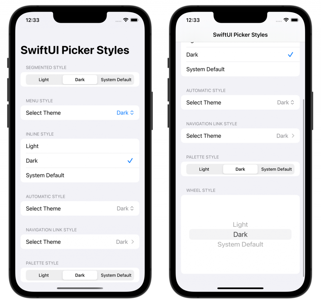
By default, the picker style is set to automatic. However, you can pick from a range of different styles depending on what you need. The above image demonstrates all different available styles on iOS. This sample application is available for you after subscribing to my newsletter.
You can configure a custom style using the pickerStyle modifier:
Picker("Select Theme", selection: $selectedTheme) {
    ForEach(AppTheme.allCases) { theme in
        Text(theme.rawValue).tag(theme)
    }
}
.pickerStyle(.inline)
In this case, we used the inline picker style which will show all available values inline with a row for each independent value. The label will be visible for this specific style as well, but it might look like an available value to select from. Therefore, I recommend using the labelsHidden() modifier to hide the label:
Picker("Select Theme", selection: $selectedTheme) {
    ForEach(AppTheme.allCases) { theme in
        Text(theme.rawValue).tag(theme)
    }
}
.pickerStyle(.inline)
.labelsHidden()
Each style works a little different and I recommend looking into default native apps like Apple’s Settings app to see which pattern works best for your usecase. You could use the navigationLink style to select a value on a new page or the segmented style if you only have a few values to pick from.
Using the default automatic picker style
If you decide to use the automatic default picker style, you have to be aware of how it picks the proper style for your configuration. The final style depends on the platform and the view type in which the picker appears. For example, the default picker styles when contained in a standard view are:
- iOS and watchOS:
wheelwill be the default style. - macOS:
menuwill be the default style (formerly known aspop-upwhich is deprecated now). - tvOS:
segmentedwill be the default style.
Do know that the container view can influence this default value. For example, the style might differ if the picker is used inside a Form element. At anytime, you can use the pickerStyle(_:) modifier to configure a specific style.
How to create a color picker in SwiftUI
You might ended up on this page looking for a color picker in SwiftUI. While similar naming, it’s a different component. There’s a specific ColorPicker element available in case you need to allow users to select a color:
struct CustomColorPickerView: View {
    @State private var selectedColor: Color = .red

    var body: some View {
        Form {
            Section {
                ColorPicker("Choose a color", selection: $selectedColor)

                HStack {
                    Text("Selected color:")
                    Spacer()
                    Rectangle()
                        .fill(selectedColor)
                        .frame(width: 40, height: 20)
                        .cornerRadius(8)
                }
            }
        }
    }
}
The picker looks as follows when used inside a Form:
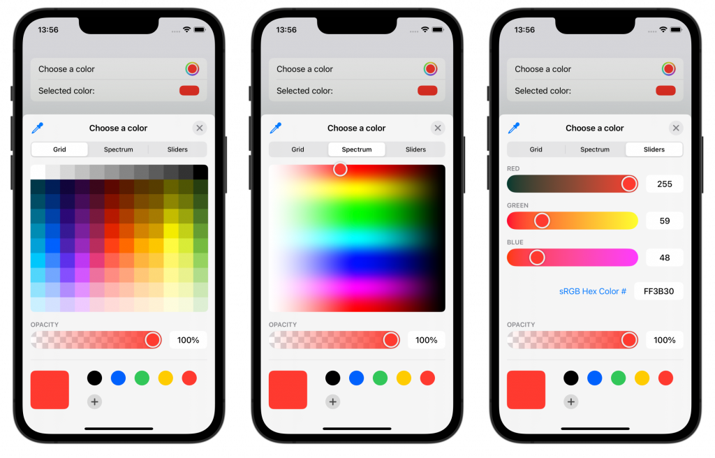
The color picker opens in a sheet and allows the user to pick a color from the screen or use the color grid, spectrum, or sliders.
Conclusion
SwiftUI offers a range of pickers to use inside your apps. Each picker style has its purpose and should be used specifically. In case you want users to pick a color, you’ll have to use the specific ColorPicker element.
If you’re interested in learning more about other SwiftUI elements, I recommend the following articles:
- SwiftUI Button: Custom Styles, Variants, and Best Practices
- SwiftUI Lists: Present rows of data explained with code examples
If you want to improve your SwiftUI knowledge, even more, check out the SwiftUI category page. Feel free to contact me or tweet me on Twitter if you have any additional tips or feedback.
Thanks!