SwiftUI Lists allow you, as a developer, to present rows of data. It’s one of the most commonly used elements when building apps and the core of many navigation flows. Presenting rows of data is simply an implementation pattern you always need. You can use different list styles, change the background color, use sections, or add selection support.
If you’re new to Swift, I recommend reading my article on Swift Tutorials or how to get started with iOS App Development before continuing. Never built an app at all? I’ve got you covered. Let’s dive in!
How to use SwiftUI Lists
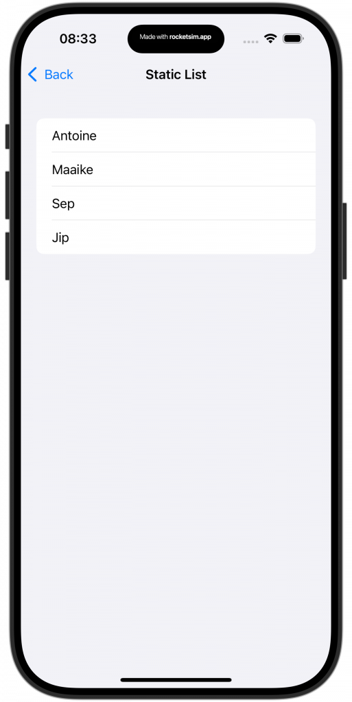
The simplest example of a SwiftUI list would be with static data:
List {
    Text("Antoine")
    Text("Maaike")
    Text("Sep")
    Text("Jip")
}
This results in a view representing rows of data inside a scrollview:

However, you often want to dynamically populate the list based on a collection of data. For example, we can define a list of people and use that instead:
struct DynamicListView: View {

    var people: [Person] = [
        Person(name: "Antoine van der Lee", age: 34),
        Person(name: "Maaike", age: 6),
        Person(name: "Sep", age: 3),
        Person(name: "Jip", age: 1)
    ]

    var body: some View {
        List(people, id: \.name) { person in
            Text(person.name)
        }
    }
}
This results in the same list as shown in the previous example, but populated using a collection of Person elements.
Note that we’re using \.name as the unique identifier for each row of data. This could result in missing data if some people have the same name. Therefore, it’s better to make Person conform to the Identifiable protocol:
struct Person: Identifiable {
    let id = UUID()
    let name: String
    let age: Int
}
If you’re new to this protocol, I encourage you to read Identifiable protocol in SwiftUI explained with code examples.
Once done, you can update the SwiftUI list to remove the name unique identifier:
List(people) { person in
    Text(person.name)
}
This results in a clean list without the risk of showing duplicate rows.
Different kinds of SwiftUI List Styles

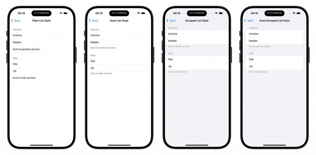
SwiftUI offers different default list styles. By default, the list style is set to automatic to adopt the platform’s default behavior and appearance based on the containment environment:
List(people) { person in
    Text(person.name)
}.listStyle(.automatic)
There are different list styles to pick from:
- Automatic (
DefaultListStyle)
Describes a platform’s default behavior and appearance for a list. - Bordered (
BorderedListStyle)
Describes the behavior and appearance of a list with a standard border. - Carousel (
CarouselListStyle)
Represents the carousel list style. - Elliptical (
EllipticalListStyle)
Describes the behavior and appearance of an elliptical list. - Grouped (
GroupedListStyle)
Describes the behavior and appearance of a grouped list. - Inset (
InsetListStyle)
Describes the behavior and appearance of an inset list. - Inset Grouped (
InsetGroupedListStyle)
Describes the behavior and appearance of an inset grouped list. - Plain (
PlainListStyle)
Describes the behavior and appearance of a plain list.
Each style is defined by a struct as mentioned in the list. For example, you can apply the grouped list style using listStyle(.grouped) or by using listStyle(GroupedListStyle()). Static Member Lookup in Generic Contexts lets you find all available list styles.
Using sections inside a SwiftUI List
An everyday use case of SwiftUI lists is to combine sections with the grouped list style:
struct GroupedListView: View {

    var body: some View {
        List {
            Section {
                Text("Antoine")
                Text("Maaike")
            } header: {
                Text("Parents")
            } footer: {
                Text("End of parents section")
            }

            Section {
                Text("Sep")
                Text("Jip")
            } header: {
                Text("Kids")
            } footer: {
                Text("End of kids section")
            }
        }.listStyle(.grouped)
    }
}
The sections group the data visually and allow you create a better hierarchy. When using the sidebar list style, you can also make the section collapsible:
struct ExpandableSectionsListView: View {

    @State private var isExpanded = true

    var body: some View {
        List {
            Section(isExpanded: $isExpanded) {
                Text("Antoine")
                Text("Maaike")
                Text("Sep")
                Text("Jip")
            } header: {
                Text("Expandable section")
            }
        }.listStyle(.sidebar)
    }
}
Supporting selection in lists
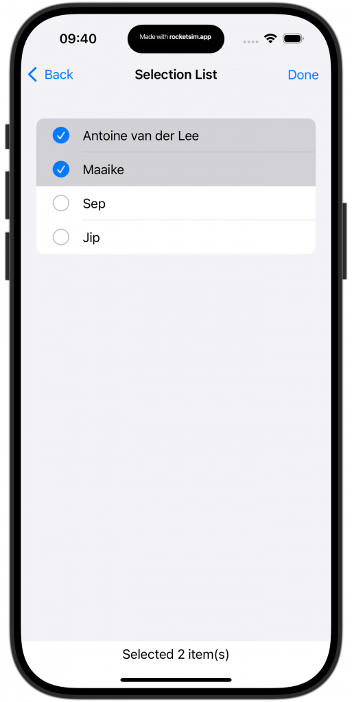
You can use SwiftUI lists to enable the selection of data. It’s most common to do this using the edit mode, which can be enabled using the edit toolbar button:
struct SelectionListView: View {

    var people: [Person] = [
        Person(name: "Antoine van der Lee", age: 34),
        Person(name: "Maaike", age: 6),
        Person(name: "Sep", age: 3),
        Person(name: "Jip", age: 1)
    ]

    @State var selectedPeopleIdentifiers: Set<UUID> = []

    var body: some View {
        NavigationView {
            List(people, selection: $selectedPeopleIdentifiers) { person in
                Text(person.name)
            }
            .toolbar { EditButton() }
        }
        Text("Selected \(selectedPeopleIdentifiers.count) item(s)")
    }
}
This results in a view that shows an edit toolbar button and a multi-selection mode:

However, you might not want to use the edit button and still offer selection. For example, you might want to use an SF Symbol in case an item gets selected:
struct SelectionSFSymbolListView: View {

    var people: [Person] = [
        Person(name: "Antoine van der Lee", age: 34),
        Person(name: "Maaike", age: 6),
        Person(name: "Sep", age: 3),
        Person(name: "Jip", age: 1)
    ]

    @State var selectedPeopleIdentifiers: Set<UUID> = []

    var body: some View {
        List(people, selection: $selectedPeopleIdentifiers) { person in
            Label(person.name, systemImage: selectedPeopleIdentifiers.contains(person.id) ? "checkmark.circle" : "circle")
        }
        Text("Selected \(selectedPeopleIdentifiers.count) item(s)")
    }
}
Changing the list background color
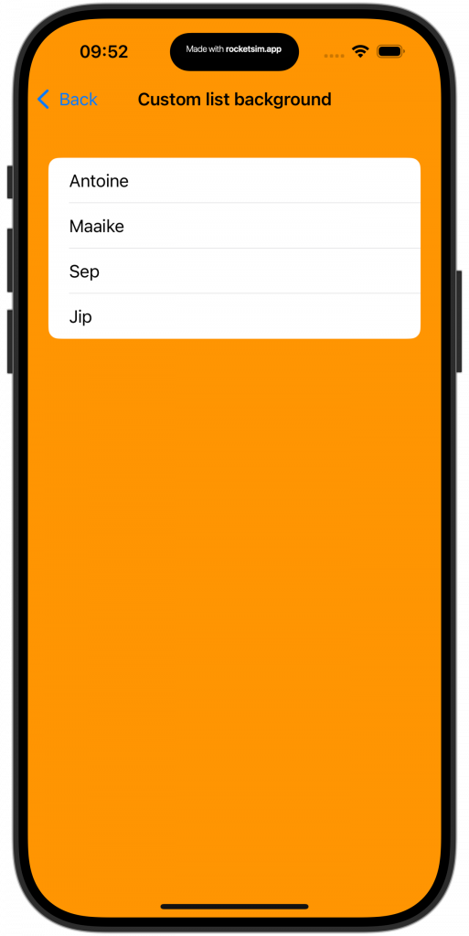
When changing the background of a SwiftUI Lists, you’ll quickly notice it won’t be updating. The key solution here is to use a background combined with the scrollContentBackground modifier:
struct CustomBackgroundListView: View {
    var body: some View {
        List {
            Text("Antoine")
            Text("Maaike")
            Text("Sep")
            Text("Jip")
        }.background(Color.orange)
            .scrollContentBackground(.hidden)
    }
}
Once you’ve set the scroll content background to hidden, you can change the background to anything you want. In the above example, we’ve created a list with an orange background color:

Conclusion
SwiftUI Lists allow you to present rows of data using different list styles. You can enable selection using edit mode or by using a custom selection representation with SF Symbols. Combined with a grouped list style, sections allow you to optimize the data hierarchy.
If you’re interested in learning more about other SwiftUI elements, I recommend the following articles:
- SwiftUI Alert Guide + Code Examples
- SwiftUI Grid, LazyVGrid, LazyHGrid Explained with Code Examples
- SwiftUI TabView: Explained with Code Examples
- Picker in SwiftUI explained with code examples
- SwiftUI Button: Custom Styles, Variants, and Best Practices
If you want to improve your SwiftUI knowledge, even more, check out the SwiftUI category page. Feel free to contact me or tweet me on Twitter if you have any additional tips or feedback.
Thanks!